Assuming that you’ve read my blog before, you can tell that I’ve updated the look and feel of the blog. I went with a little cleaner and simpler design. I liked the old look, but for some people the gray text on a black background was a little hard on the eyes.
I do like the newer title display. It has a nice little graphic on the left edge showing the month/day the article was posted. The category name is below the title (“Miscellaneous” for this particular article) and is a hot link to that category, and the link to add a comment is now along the right edge of the title.
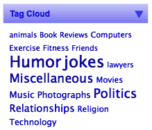
Additionally, there is a new “Tag Cloud” section in the right sidebar, a sample of which is shown below. It lists all the tags I used to categorize the articles I wrote. You can tell by the size of the word how often that particular tag was used. The tags themselves are hot links and will display all the articles associated with that particular tag.

Finally, you can collapse any of the sidebar lists by clicking on the little triangle on the right edge. Also, you can rearrange the lists by left-clicking and dragging the individual lists.
Anyway, I hope you like the new look. I tested the website on Windows using IE6 and IE7 and on Mac OS X using Safari and Firefox. If you have any suggestions or comments, they’re always welcome.

